
![]()
|
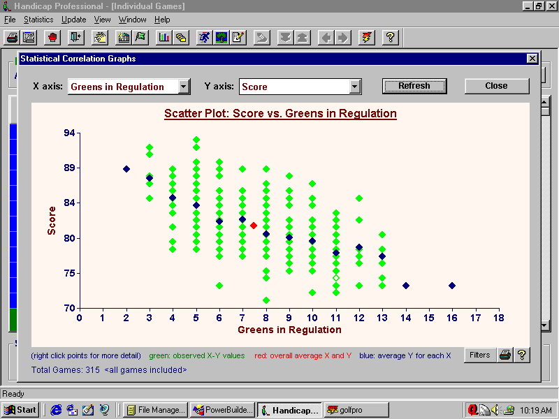
Screen Shot - Correlation Scatter Plots |
|
One of the most informative functions is the Correlation Graph
display. It allows you to plot any scoring statistic against any other
statistic in a scatter plot graph. This allows you to see how a specific
statistic affects your score. Trend lines in blue illustrate average values and reveal the correlation between your statistics. In the example below, scoring average is plotted against greens in regulation. You can extrapolate along the trend line to see how increasing your GIR % is likely to lower your average score. |
![]()

Home Overview
Features Screen Shots Downloads
Purchasing FAQ's System Requirements Technical
Support Contact Us
![]()